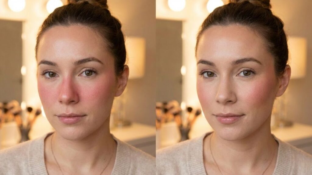
From a distance, she looked flawless. Her brows were shaped perfectly, eyeliner sharp, and lips glossy. But as she stepped closer to the window, something felt off. A bold stripe of blush sat too close to her nose, almost like she had sprinted up the stairs. The product itself was good — the placement wasn’t. You’ve probably seen this before in real life or on social media. Blush sitting too close to the center of the face can shrink features and create a cramped appearance. In bathroom lighting it may seem fine, but natural daylight or camera flash reveals the imbalance instantly. Just a tiny shift — even two centimeters — can separate a fresh, lifted glow from a compressed look. This isn’t about trends. It’s about facial geometry.
How Blush Near the Nose Affects Facial Balance
When blush is placed too close to the nostrils, it pulls attention toward the center of the face. Instead of enhancing cheekbones, it makes the middle area appear busy and heavy. The outer cheeks fade visually, and your face can look narrower or more strained. Cameras make this worse by sharpening shadows and blending blush with natural redness around the nose. Under harsh lighting, the color can appear like a solid block instead of a soft gradient. Professional makeup artists often talk about a “danger zone” around the nose because too much color there shortens the vertical proportions of the face. Since the face is made up of vertical and horizontal balance lines, shifting blushing ward compresses those lines visually.
Smart Blush Placement for a Lifted Look
To keep your face looking open and balanced, start with a simple guide. Imagine a vertical line dropping from the center of your eye — that’s your inner boundary. Your blush should stay outside that line. Apply color on the part of your cheek that lifts slightly when you give a soft smile. Then blend upward and outward toward your temple in a gentle curved motion. Leave a small gap of bare skin beside your nose. Many people over-apply because they focus too literally on the “apples” of the cheeks. On round faces, inward blush makes cheeks look heavier. On angular faces, it sharpens the center unnecessarily. The fix is small but powerful — move the color slightly outward and the entire face appears more lifted in photos.

Designing Your Own Facial Balance Beyond Trends
There is no single correct placement for blush — it depends on the effect you want. Bringing color slightly inward can create a soft, youthful flush. However, crossing too far toward the nose stops looking intentional and starts looking crowded. Beauty trends, including Korean-inspired central blush styles, can look playful when balanced properly. The key is awareness. Try applying blush your usual way on one side of your face and slightly higher and farther out on the other. Take a photo in natural daylight and compare. Notice which side highlights your eyes and which side draws attention to the center. This experiment helps you see how placement controls focus. Your face isn’t something to fix — it’s something to design thoughtfully.

Quick Placement Rules for Everyday Makeup
• Leave about one finger’s width of space between your nose and blush.
• Angle the brush slightly upward instead of sweeping straight across.
• Remove excess product before touching your skin.
• Blend more on the outer edge than the inner edge.
• Step back and check your look from arm’s length.
These simple guidelines are easier to follow than complicated contour maps. They work whether you’re using a budget cream stick or a high-end powder compact.

Blush Placement Reference Table
| Key Focus Area | Updated Guidance | Why It Matters |
|---|---|---|
| Space Near the Nose | Keep a narrow section of bare skin between the nose and blush placement | Avoids a congested center and maintains natural facial balance |
| Blush Positioning Rule | Stop application before reaching the vertical line below the eye’s center | Creates a lifted effect rather than a weighed-down or puffy look |
| Blending Direction | Diffuse color outward and gently upward toward the temples | Visually opens th |